Remedy built Control Resonant's "Strange York" and left out the yellow paint on purpose
In a PlayStation Blog deep dive, Remedy's art and design leads explain the deliberately unreal Manhattan, medieval boss iconography and grounded animation. Director Mikael Kasurinen separately defended skipping the industry's favourite navigation crutch.
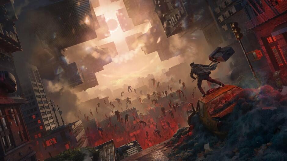
Remedy has published a long look at how Control Resonant was designed, and two threads run through it: the city is intentionally not the real New York, and the game refuses to point at things.
Strange York
Speaking on the PlayStation Blog, lead level designer Anne-Marie Gronroos, art director Elmeri Raitanen and lead gameplay designer Sergey Mohov described a Manhattan built for contrast rather than accuracy. Mundane stretches act as what Gronroos calls a "palate cleanser" between paranormal zones, and the team kept details real New York has lost - phone booths among them - to land on a look they call "Strange York."
Raitanen pointed to "dynamic destruction and reactive environments" as what makes combat land across the expanded open world, and said each boss was built around a single theme, leaning on medieval iconography to "evoke awe." On the character side, the team worked against the power fantasy: "There is a deliberate groundedness in how Dylan moves," Raitanen said, so that the abilities read as costing something. Mohov framed the throughline as "somebody can be really powerful, but yearning for human connection," and credited the DualSense triggers for selling the effort - "getting that feeling of resistance contributes greatly to making abilities feel powerful."
No yellow paint
Separately, director Mikael Kasurinen laid out why Control Resonant avoids the yellow-painted ledges and doorframes that have become a running argument in game design. On the Dropping Frames podcast he framed it as a question of agency: "If it feels like it's like 'go here,' it's not anymore a decision for the player." He said he wants people to "doubt themselves, go back, check again."
What replaces it is environmental: lighting, in-world props, and a consistent gravity direction that rain and wind obey, so players can orient themselves in a city the Pattern has bent out of shape.
Why it matters
Yellow paint is one of the few design arguments that reaches past developers to players, and it is usually framed as accessibility versus immersion. Remedy is one of the bigger studios to put its reasoning on the record for choosing neither - and to say what it built instead.
Why it matters
Signposting is one of the few design debates players argue about directly, and Remedy is a major studio putting its reasoning and its alternative on the record.